During our product redesign, several inconsistencies became clear: too many variations of primary CTAs, identical components behaving differently across pages, and the need to extend existing UI patterns into new contexts.
It became evident that we needed structure and coherence.
Initially, the goal was purely operational — to gather all UI elements in a single Figma file so changes could propagate efficiently across all ongoing projects.
Over time, that practical step evolved: we began grouping elements, defining visual foundations, and creating categories to align design and development under a shared logic.
The idea didn’t come from a long-term strategy or a corporate directive, but from a concrete necessity: bringing order to chaos.
Each new feature meant reinventing interface parts, duplicating patterns, or re-deciding details already discussed.
Creating a design system became a way to regain efficiency and consistency.
We started small — with colors, typography, and spacing — and gradually expanded the structure into a full visual framework.
The first version of our system wasn’t an official project but a survival strategy that later evolved into a methodology.
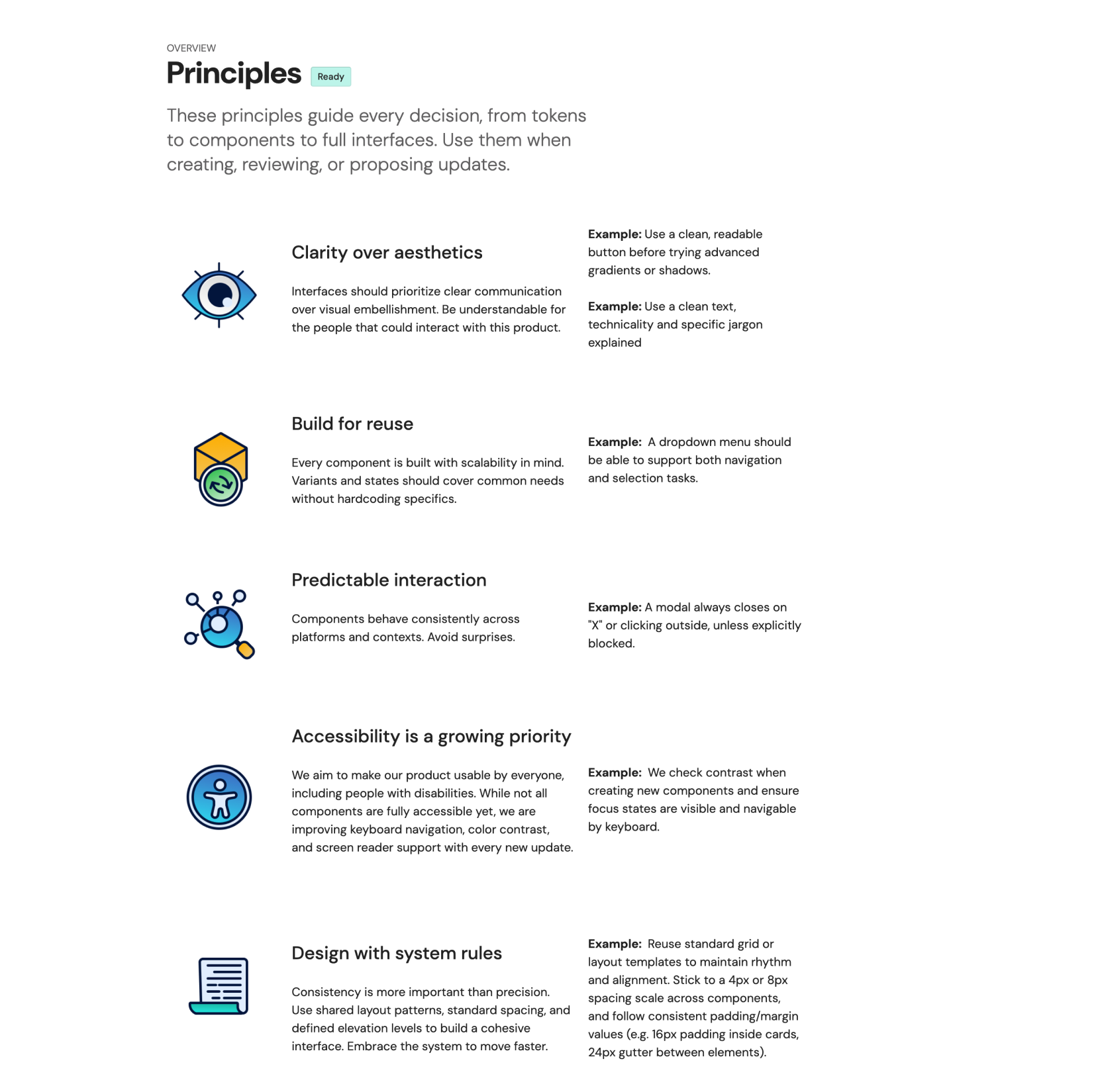
Before diving into the design system itself, I realized we needed a foundation of core design principles — a set of rules to guide every decision, from tokens to components and complete interfaces.
These principles didn’t emerge from theory but from real needs identified during multiple sessions with the development team, as we worked to design and implement new elements. They became essential not only for updating existing components but also for shaping the ones that would come next.
That’s how we defined our five guiding principles:
Clarity over aesthetics, Build for reuse, Predictable interaction, Accessibility is a growing priority, and Design with system rules.
They became our compass — helping us align decisions across disciplines and ensuring that every new addition to the product felt part of a coherent whole.
After studying well-established design systems such as Atlassian, Carbon, Lightning, Polaris, and Fluent, I began to organize and refine the structure for our own. During this phase, I used artificial intelligence as a reflective tool — a way to question assumptions, clarify reasoning, and structure complex ideas.
It became a space for exploration and comparison: testing naming conventions, organizing hierarchies, and evaluating how documentation might be understood by non-designers.
The process was entirely guided by my own decisions and experience, while AI served as a tool to frame doubts and push reasoning further.
The part that required the most reflection was the classification of components — understanding how to organize them meaningfully and, by analyzing our actual workflow, identifying the underlying principles that guided each decision.
That reasoning shaped the system’s foundation even more than its final structure.
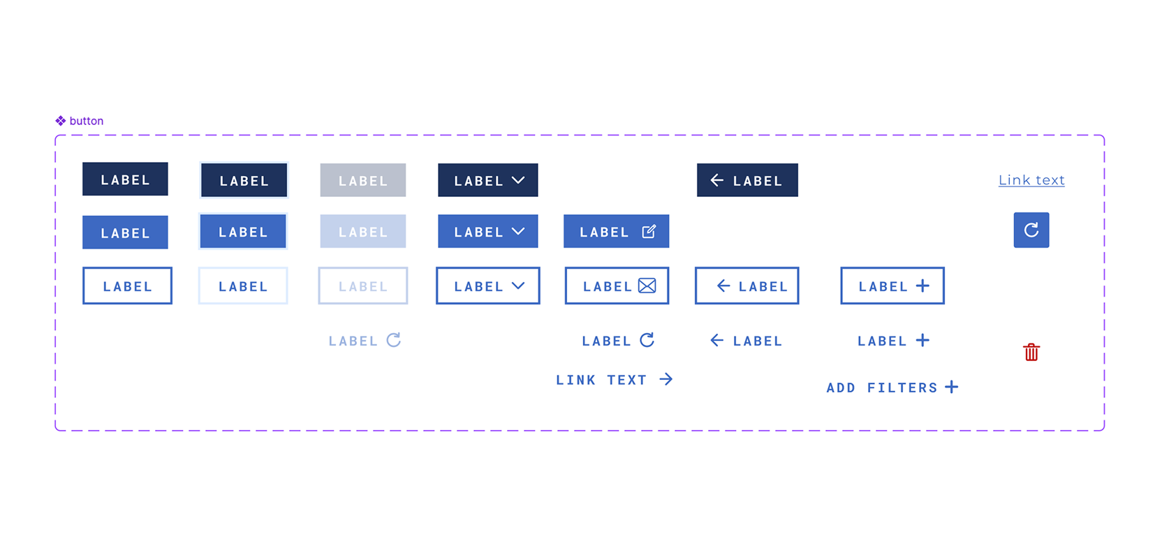
At the beginning, we didn’t yet have design tokens, but we did have clear principles. We defined a spacing scale, a cohesive color palette, and a readable typographic hierarchy. Each decision was progressively documented in Zeroheight through concise explanations, visual examples, and practical usage notes.
Accessibility quickly became part of the process. We ran user tests to validate legibility and color contrast and, even though it required widespread updates, we acted: removing overly light text colors, redefining shadows, borders, and outlines to improve clarity and visibility.
These changes were not just visual tweaks — they represented a deliberate design choice toward clarity and inclusion.
.png)
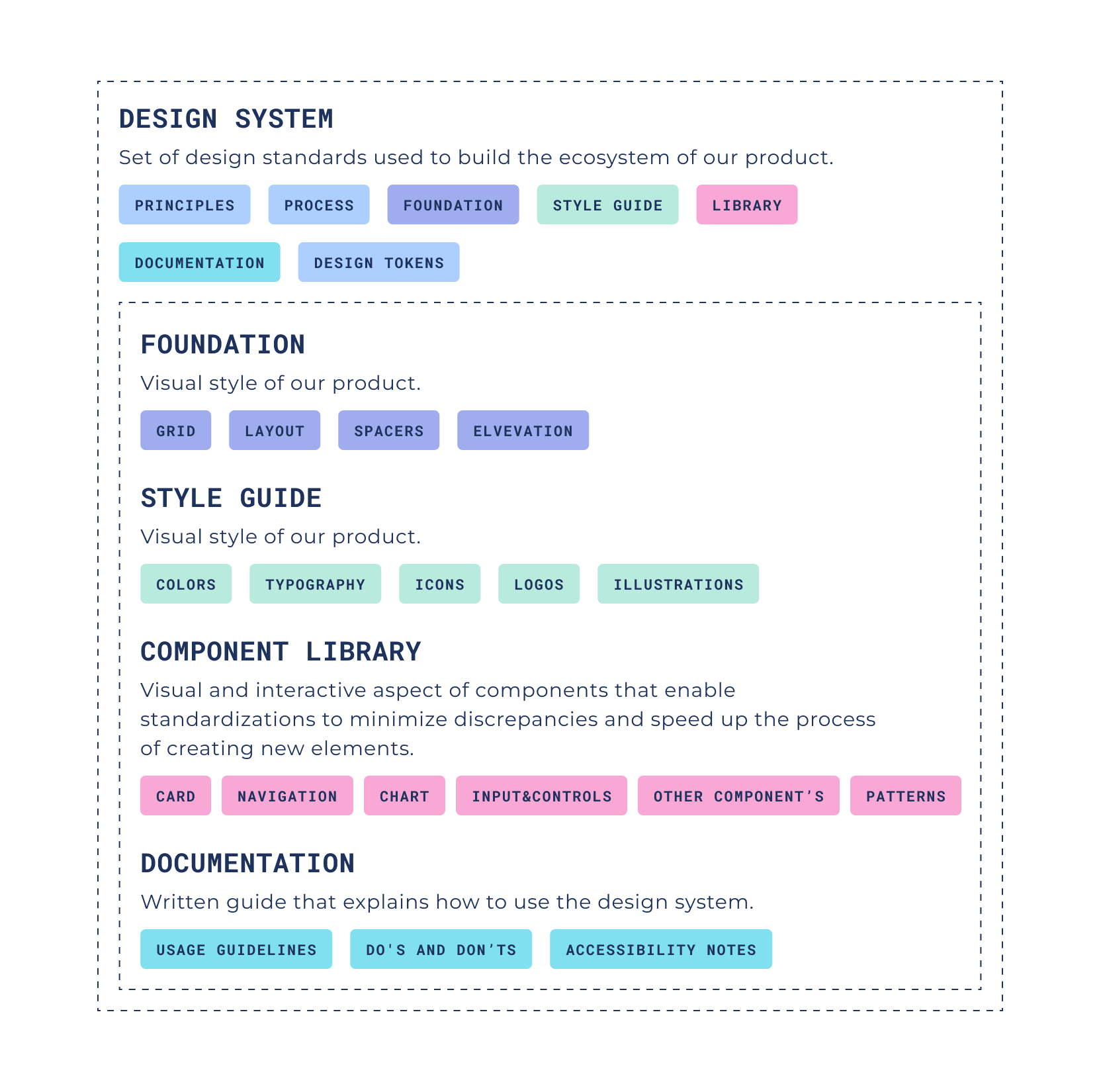
As the library grew, we needed a solid structure. We organized the system into four key sections:
Each section builds upon the other, forming a scalable and coherent foundation. This structure allows the design system to evolve naturally without losing clarity or hierarchy.
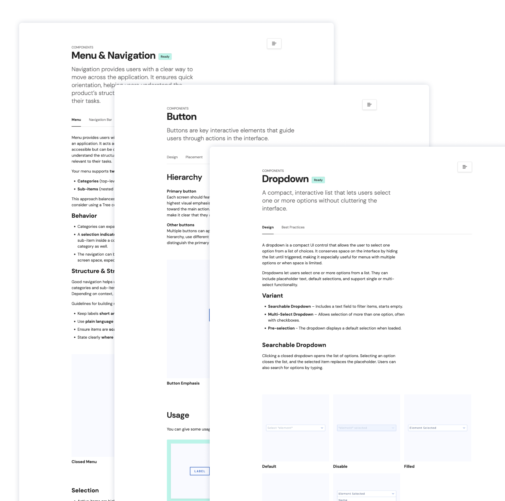
From the analysis of different design systems, I identified the structure most suitable for our product. This helped me define how to organize documentation pages: the section layout, where to include supporting explanations, and the right level of detail for each component.
Each element was described not only visually, but also through its function, behavior, and context of use.
Our workflow is iterative and collaborative across disciplines. When a design issue or new need arises — a layout inconsistency, a missing state, a new interaction — we discuss it, explore solutions in Figma, align on a direction, and implement it.
We work within a platform that offers both robustness and flexibility, requiring thoughtful collaboration between design and development.
Some ideas evolve as we adapt them, refining both the design and its implementation. This balance between exploration and execution makes the system stronger with every iteration.

The hardest part was keeping documentation useful but lightweight. Each Zeroheight page follows a simple and consistent structure:
We applied this model to every section — from typography and colors to buttons, chips, dialogs, and feedback messages. The goal was to make each page accessible and understandable for anyone, not just designers.
Building a design system from scratch is a constant balancing act. It’s easy to chase perfection, but the real value lies in continuity and learning.
We learned early that structure comes before detail. Defining categories, naming conventions, and decision principles from the start prevents confusion later on.
Another ongoing challenge is maintaining the right balance between creative ambition and technical implementation. Each iteration requires fine-tuning and dialogue — but that’s what allows the system to grow without losing flexibility.
The process remains ongoing and adaptive: every change and refinement sharpens the system’s form and clarity. It’s more than a collection of components — it’s a shared culture of design maturity.
We’re now introducing our first design tokens and continuing to refine accessibility standards. Establishing a shared visual language between design and development has already improved our speed, clarity, and confidence as a team.
The system is not finished — and it shouldn’t be. It’s built to evolve, question after question, update after update. Each iteration helps us design better, faster, and with greater intent.
If you’re starting your own design system journey, don’t wait for perfection. Start with one rule, one color, one component — the rest will grow with you.


